Gaze Plots
These are the small plots displaying the order and conducive time taken to browse, could be an audio-visual display or any print material or any website. The principal function of a gaze plot is to educate about the time sequence of viewing or where and when we stare. This time spent gets expressed through the use of circles when looking at the Tobii pre-defined filters (Attention & Fixation filter). The larger circle represents the maximum amount of time spent by the viewer on browsing the particular segment of the advertisement.
The below picture shows an example for a single eye tracking participant looking at a Pepperidge Farms Goldfish crackers box. The numbers depicted in the circles show the sequence and fixation of particular person in which he views the specific piece of presentation. From the below picture it will be apparently visible as to how the gaze plot works.
The below plot shows a looking pattern of the viewers who observed the brand in a sequential order, the order may or may not be similar. The group had longer first fascination which represents that the group was highly engrossed towards the features. This bunch of people showed higher intent to purchase the product being displayed as compared to the other group of people who showed more interest in the size of the package or the ingredients of the product. Overall, it can be concluded that in case the logo and the product are more firmly displayed along with the visual projection of the logo and the branding, it would result in increase in sales substantially.

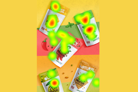
As useful the plots can be, they come with their own limitations, this tool will be most ideal as uniform perception when only either one/ two participants data are shown as the display can become a mess. In case, the number of participants are increased, then it may become a superimposition of images and information. This activity will deviate the only purpose of analyzing through use of gaze plots. The second image shows this study of around 30 individuals and how the gaze plot would look like in the below package. However, an exception to this particular exercise would be an animated video showing the flow activity of the gaze plot. Here, the video can display visual study of many participants and it would be an easier job to judge different viewing patterns which can show the task completion rates.
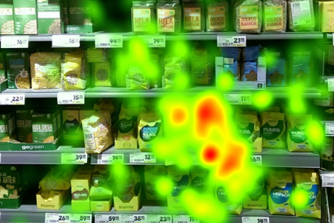
Heat Maps
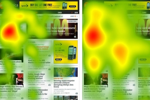
Heat Maps show how a page is viewed by the participants and which part on the page receives the most attention. Heat maps make use of color combination to display the results. The focus is not on any one/ two fixations but, it can reveal the focus of visual thinking for large number of participants at a single time. So this goes just into the opposite direction in a way the gaze plot works. There is no sequence of fixations in the heat maps. Actually, the one answer that is exhibited by heat maps is the location where the most important content should be on a page. If this technique is improperly described the heat maps can do more to distract. If the objective to be achieved is clear then the heat maps are of prime importance.
The below heat maps show the browsing attitude for the particular page- one page displays the current description and the other depicts the future/planned description of a product. From the results, it is clear that the second picture has more area and range of distribution which denotes a deeper understanding and the maximum time taken by the participant on the page. For making the use of heat map, complete and focused attention to the data format is of prime importance as the data interpretation has to be proper.